Every month the Bureau of Labor Statistics (BLS) releases the latest estimate of “the unemployment rate”, grabbing a few headlines and occasionally spawning confused debates. This article should serve as a simple primer on what the unemployment rate measures, how it’s calculated, and why it matters.
What is an Unemployment Rate?
An unemployment rate is deceptively simple to calculate:
1 – (the ratio of employed people to the size of the labor force)1.
This is easy to describe, but the “deceptively simple” part is in the details:
- Who counts as employed?: While it’s pretty obvious that full-time workers count, do seasonal agricultural laborers? Teenagers? Part-time workers? Self-employed contractors?
- Who counts as in the labor force?: Anybody you count as employed belongs in this group, but other groups that have to be considered are discouraged workers (people who have given up looking for jobs), retirees, stay-at-home parents, and any other groups who might be able to work but aren’t and aren’t currently searching for work.
The Numbers From The BLS
Since 1995 the Bureau of Labor Statistics has reported 6 different estimates of the unemployment rate on a monthly basis. They are drawn from data collected through the Current Population Survey, which gathers employment and labor force participation data from 60,000 households on a monthly basis2. The differences between the six estimates all stem from applying different answers to those two questions above: who counts as employed, and who counts as in the labor force. The estimates are labeled U1 through U6, as follows:
U-1: Persons unemployed 15 weeks or longer, as a percent of the civilian labor force
U-2: Job losers and persons who completed temporary jobs, as a percent of the civilian labor force
U-3: Total unemployed persons, as a percent of the civilian labor force (the official unemployment rate)
U-4: Total unemployed persons plus discouraged workers, as a percent of the civilian labor force plus discouraged workers
U-5: Total unemployed persons, plus discouraged workers, plus all other “marginally attached” workers, as a percent of the civilian labor force plus all “marginally attached” workers
U-6: Total unemployed persons, plus all “marginally attached” workers, plus all persons employed part time for economic reasons, as a percent of the civilian labor force plus all “marginally attached” workers
There are a few key terms in the descriptions that provide answers to our two questions of who counts as employed and who counts as in the labor force.
Civilian Labor Force: the sum of the employed plus the unemployed.
Employed: all persons who, during the reference week, a) did any work at all as paid employees, worked in their own business, profession, or on their own farm, or worked 15 hours or more as unpaid workers in an enterprise operated by a member of their family, and b) all those who were not working but who had jobs or businesses from which they were temporarily absent.
Unemployed: a) persons who had no employment during the reference week, were available for work, except for temporary illness, and had made specific efforts to find work sometime during the 4-week period ending with the reference week, and b) persons who were waiting to be recalled to a job from which they had been laid off, regardless of whether they have been looking for work.
Discouraged Workers: those who want a job but have given up the search for work because they believe no jobs are available for them.
Marginally Attached Workers: those who want a job and are available to work now, and have looked for a job in the past year–but not in the past month–for a wide range of reasons that extend beyond discouragement over job prospects.
As noted in the descriptions, U-3 is the official unemployment rate, which is the one that gets reported in news articles after the monthly data releases by the BLS. U-1 is a measure of long-term unemployment, while U-2 highlights the rate of job losses. Meanwhile U-4 through -6 count increasingly broad swaths of underutilization of the workforce. When the “right” measure of unemployment is debated, U-3 is commonly contrasted with U-6. Where U-3 considers only the formally “unemployed”, U-6 adds in people who can’t get enough work, who have given up looking even though they still want to work, and who have had problems staying in the job market due to various issues (i.e. health, transportation, child care, etc.)
As you can see, there is a significant gap between these two measures of un/underemployment, which is to be expected given the larger net cast by U-6. We can see how much of a jolt the housing crash gave to not only the level but the quality of employment. When the economy hit bottom in early 2010, not only had U-3 just avoided 10%, but U-6 surpassed 17%. In other words the number of people scrambling to find a new job were dwarfed by the number of people who wound up with reduced hours or spotty employment, or who simply gave up and left the job market.
One disturbing note is that the gap between these measures seems to be growing. At the lowest point of unemployment under Clinton, the gap between U-3 and U-6 was about 3%, under Bush it had grown to over 3.5%, and as of February 2017 (as close to full employment as we’ve been since the crash) it’s about 4.5%. Whether this is just a fluke or a sign that the economy is increasingly unable to include all workers is unclear at this point, but it bears watching.
How High Is High?
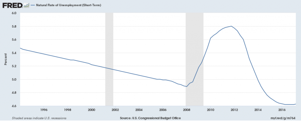
Without context these numbers are not very helpful in determining what’s going on with the economy. How high is too high? Ideally unemployment should be as low as possible without causing negative consequences to the economy. In economics this is embodied in the concept of a “natural rate” of unemployment, where the level of unemployment is just low enough that wage growth does not trigger an increase in prices. In practice this is estimated as the NAIRU, the Non-Accelerating Inflation Rate of Unemployment.
As can be seen, during the period we looked at for U-3 and U-6, NAIRU had been declining up until the crash in 2008 when it spiked, and it’s now lower than it has been for a couple of decades. However, during that entire period it has floated within a 1 percentage-point range. All things being equal unemployment significantly below 5% is prone to raise the inflation rate, but unemployment significantly above that level is leaving meat on the bone when it comes to fully leveraging the workforce.
David is one of the earliest writers for Torchlight, and also pinch hits on website support and editing/posting. He holds a PhD in Economics, which with $5 would get him a latte; sadly, he doesn’t even like coffee. He can be reached at dspitzley@torchlightmedia.net.
Footnotes
- If you skip the subtraction you get the employment rate, but since that tends to float around the mid- to low-90% level, the unemployment rate is generally used because variation over time is clearer.
- The BLS also conducts a monthly Current Employment Statistics survey (https://www.bls.gov/ces/home.htm), gathering data from businesses on number of employees and job openings. The employment estimates from the two surveys are usually in sync (https://www.bls.gov/web/empsit/ces-cps-chart.pdf)


